keycap design
| 
|
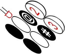
This is an exploded diagram of a "rubberized" keyboard design. It enables the keycaps to have one
clear label on them for normal use and a
another label for use in "shift" mode. When the shift key is pressed, the LED lights up. The mask
transmits the shape of the secondary label. The ink for the primary label is semi-transparent and
the same hue as the LED. Therefore, the viewer sees a backlit secondary character when in shift mode.
The mask is a complementary color, in practice it will be green. The primary label will be slightly
less legible than a normally printed one, but this is a reasonable compromise: 1) since it's bigger, its
lowered contrast has less of an effect, and 2) since the QWERTY layout is well-known, it's more
important that the shift keys -- which are nonstandard -- are more legible.
|
|